Category: Travel

They Came From the Rising Sun
They Came From the Rising Sun

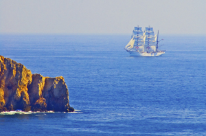
A Portuguese ship off the Algarve. Photo (c) Karen Abrahamson

I’ve spent much of this blog writing about the great European mapmaking tradition and the exploration that went with it, but long before European Kings considered funding a certain wild venture to reach India and China by sailing west across the Atlantic, and long before Vasco de Gama sailed round the Cape of Africa and into the Indian Ocean, the Chinese were venturing westward, too. They sailed from Canton and through the Malay straight and into the Indian Ocean. They mapped it, too.

Chinese records indicate that trade between China and Africa began as early as the Han Dynasty (202 BC to AD 220). Two of Africa’s most powerful nations of the time, Kush and Axum had trade relationships through intermediaries. In Kush the remains of ancient pottery and bronze utensils indicate that they may have been copying the styles of the Chinese goods being brought to its ports by Arab traders. Axum may have been the source of the rhinoceros horn, ivory and tortoise shell that Roman traders took to China in AD166.

But this was trade by intermediary, not face to face trade. The first trade by Chinese with African is thought to have occurred not much later, but it probably didn’t occur on African shores. Accounts of ancient travelers indicate that in places like Ceylon merchants and sailors from as far afield as China, Persia, Homerite countries and Adulis (an African port city) came together to trade. One Chinese trader, Fa Xian, stayed in Ceylon for two years before returning home to write his accounts of the people he met.
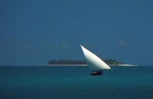
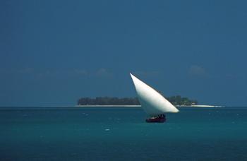
Dhow off Zanzibar Island (1994) Photo (c) Karen Abrahamson

During the time of the Tang Dynasty (618-907) records show that a Chinese did set foot on African soil. Du Huan, was a Chinese military officer who was captured by the Arabs during conflicts near Samarkand. After spending twelve years in the Abbasid Empire, he reappeared and wrote a record of his travels. Of the bits of that memoir that have been preserved over the ages, he speaks of travelling south over a great desert to the land of the black people, where there was little grain and no vegetation and malaria was endemic. Researchers today think this was probably modern-day Eritrea.

A Chinese junk from the 1270s was discovered in Guangzhou harbor in 1974 with cargo such as tortoiseshell, frankincense and ambergris that strongly suggest trade with Africa. Between 800 and 1400 Chinese goods were also making their way to Africa so that Chinese porcelain became common as decorations on houses and mosques and broken porcelain still apparently litters East African beaches. Chinese coins from the Tang Dynasty (the kind with the square hole in the middle) have been found along the coast and on islands like the Bajun and Zanzibar.
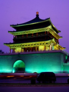
Chinese tower, Xi'an, China (1998) Photo (c) Karen Abrahamson

Of course, the Chinese travelers to these distant shores in these early days weren’t representatives of the Chinese dynasties. No they were merchants and traders. Most of these went as far as India and no farther and were content to trade with the middlemen who brought goods from Africa. But a few travelled further and the routes were known in the Kingdom of Heaven. In the ninth century the Tang Prime Minister and geographer, Jia Dan, knew of the sailing routes that gave 90 days from Canton to Arabia and 20 days for a further voyage southwest to a country called Sanlan.
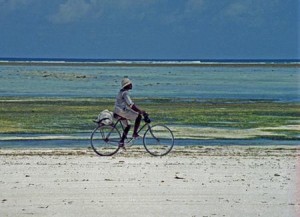
Cyclist on the western Zanzibar beach. (1994) Photo (c) Karen Abrahamson

Of course, if the Chinese were anything like the later Portuguese, this information could have come from Arab sailors as a result of the government confiscating all maps from visiting sailors, but a map compiled between 1311 and 1320 by the Chinese cartographer Zhu Siben clearly shows the triangular southwest pointing African continent at a time when the western world thought that Africa didn’t end, but instead the landmass continued on eastward before joining the mainland again and enclosing the Indian Ocean as a great inland sea.

Just think of what this map suggests: The Chinese were there first. If they had kept going, they could have discovered Europe long before the Europeans ‘discovered’ the route to China.


The Comet and the Cartographer

The Comet and the Cartographer

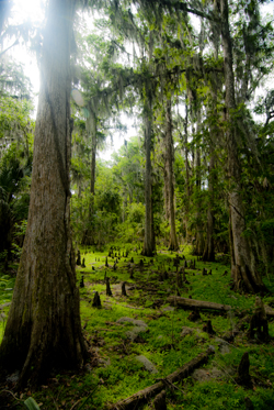
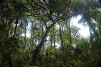
Cypress tree, Northern Everglades (2012) Photo (C) Karen Abrahamson

I’ve written earlier about the way maps are used to convey information about our world and how the information maps convey has extended far beyond the basic morphology, and the boundaries and formations humans place upon the earth. But how did the idea of using maps to present things like the distribution of population and average income come about?

The potential for such maps stretches right back to Ptolemy, but it was a certain Edmond Halley who made the first of what are known today as thematic maps. You see Halley, the same Halley who was a friend to Isaac Newton and who, in the 17th century, predicted the periodic return of a certain comet, also predicted that certain phenomena may be better presented as maps than through the use of words. He produced what is considered the first meteorological chart – of prevailing winds. He also published a map of the North and South Atlantic which showed variations of terrestrial magnetism by charting variations of the compass needle from true north. His map, created after two years of observations, charted these variations by using curved lines on a map that connected areas of equal value—a process that is used today, with isolines connecting areas on a map of similar elevation or depth.

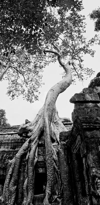
Fromage Tree, Angkor, Combodia (2009) Photo (c) Karen Abrahamson

The inspiration Halley provided led to the creation of maps in the 19th century that set out similar lines, isotherms, for temperature and isobars for barometric pressure. In the 19th century other means of conveying information beyond basic geography were also developed. For example, the use of larger or smaller circles to convey larger or smaller cities. Plotting of incidents of cholera and London water pumps on a map not only showed where the deaths occurred, but also demonstrated the use of maps as analytical investigative tools when all the deaths could be linked to a single water pump.

The development of thematic maps has continued, with odd maps called ‘winds of influence’ that group places of similarity such as use of technology, so that, in the 1980s, first-world countries were grouped closely together, while third world countries were separated by distance, illustrating how far behind some countries were. Maps of influence helped track and demonstrate the spread of botany across the South Pacific, and also gave clues to the spread of Polynesians over the Pacific.

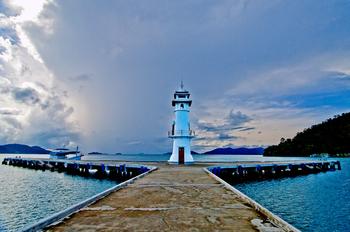
Lighthouse, Ko Chang, Thailand. (2009) Photo (c) Karen Abrahamson

So while Halley gifted us with the understanding that a comet returns periodically to our night skies, his greater gift might be the idea that maps can be so much more than representations of geography and international boundaries. Most of all, his use of isolines led to the bloom of maps as a means of showing the connections within our world.


Knowing Where We Are in the World – and in Story

Knowing Where We Are in the World – and in Story

Cypress tree, Northern Everglades (2012) Photo (C) Karen Abrahamson

I’m currently working on two pieces of writing. One is the third novel in the Terra Trilogy and the other is the third installment of the Ice Dragon Series of short stories. Working on these two projects has made me question how I know where I’m going and how do I know where I am in relation to everything else in both these stories. It brings to mind the question of how we know, in our real life, where we are in relation to the rest of the world.

In this day of GPS and mapquest etc. this might seem like a very easy question to answer, but it wasn’t always this way, just like I wasn’t always able to have a sense of where I am in a story. Yes, surveyors took it upon themselves to survey the world. Countries (and scientists) agreed on the prime meridian that impacts all our time zones. But the 20th century has primarily been concerned with improving the precision of mapping and in particular with ensuring the pinpointing of places on the map in relationship to the rest of the world. The US Geological Survey was involved in this through most of the 20th century.

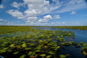
Waterlilies, Northern Everglades (2012) Photo (c) Karen Abrahamson

Why is this important? Well, think about it. Without standard understanding of how everything relates to everything else, weird things happen, like bridges getting built from each shore that don’t meet in the middle, or highways that have weird jogs in them because the measurements allowed the two ends to miss each other. It might not be important to you, but the cost overruns of such mistakes make having a common context for measuring everything important because it stops these types of things from happening.

In North America, the result of the surveying is those nice little brass discs (known as monuments) set in concrete or rock dotting the landscape . Each of these little brass discs serves as a known point for all subsequent surveying in the area. How did they know the individual location of these monuments? They took meticulous measures of distance through triangulation surveys and also measured the azimuth—the direction of Polaris—to set each monument’s position.

Throughout America, broad swaths of land were surveyed independently to create grids of known locations. They measured locations not only horizontally across the landscape, but also vertically, in relation to sea level, but the challenge was knowing that all these grids fit together. The result was the selection of a single monument at a ranch in central Kansas, Meades Ranch, as point zero for all grids across the country. Meades was chosen because it sat centrally in the US and it lay close to the crossing of two major survey lines across the US – one from Canada to Mexico and the other from the Atlantic to Pacific Ocean. Interestingly, today Meades Ranch has been superseded by global positioning that uses the center of the earth as the central point of reference.

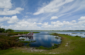
Airboat docked in the Northern Everglades. (2012) Photo (c) Karen Abrahamson

The use of that central point for mapping draws me back to my thoughts on plotting a novel or story. I once heard the wonderful writer, Nancy Kress, talk about plotting. Now I don’t know how you feel about plotting—some people are all for detailed plotting of everything in a novel, while others prefer to fly by the seat of their pants (Pansters) and write into the mist of their imagination. Nancy Kress seemed to offer a third alternative that didn’t hold a writer’s imagination down, but also gave some structure to writers so that all that lovely mist didn’t turn into a dense blinding fog. Ms. Kress suggested that writers need to write down what they think is going to happen in the novel. Just brainstorm them out. Ask yourself what is the beginning (the inciting event) and what is the midpoint (quiet often a reversal of some sort), and how do you think the story will end (the climax)? Once you have those key points identified, you can easily place them on a plot line and them locate all your other plot ideas on either side of the midpoint—a lot like being able to measure your location from Meades Ranch.


Lines Maps and Narrative Maps: they both have their place

Lines Maps and Narrative Maps: they both have their place

The nieces who never really cared if we were lost as long as we had fun.(2012) Photo (c) Karen Abrahamson

I wrote earlier about how maps on a page (or electronic maps) have taken the place of the narrative maps of old, but my recent trip to Disney World and Orlando Florida brought home how narrative maps are still an integral part of our lives.

So what’s a narrative map? It’s the ‘written out in long hand’ directions of how to get to where you are going. It’s the old man at the side of the road who tells you to drive until you see a red barn and take the right fork at the next crossroads, or the young woman at Disney’s Magical Kingdom who tells you to go up past the camel and turn right to get to Fantasyland, or Frontierland. Narrative mapping is what we do naturally when someone asks for directions—we try to guide them, through language, via visual cues to wherever it is they are trying to get to.

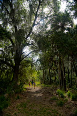
Wandering the cypress grove island, Northern Everglades, Florida (2012) Photo (c) Karen Abrahamson

Upon reflection, even though I love line maps, I seem to have a preference for narrative maps whether spoken or written down. Case in point was finding my way around Orlando. My sister played driver and I was the navigator with the maps. Often we had multiple maps, some solely focused on presenting a flat earth representation of the highways, streets and avenues we needed to navigate through. Others though, like the one from our hotel, and the one from our swamp guide, came with narrative directions of how to find our way. Some had distances involved (travel 5.5 miles to X street), others referenced signage (track left at the X sign). Invariably, I’d have the line map spread on my lap, but it was the narrative map that I followed in order to navigate our travel.

Cypress knees and trees, Orlando (2012) Photo (c) Karean Abrahamson

This got me thinking that, just like the medieval pilgrims to the Holy Land who depended upon written guidebooks for their journey, I seemed to have a preference for the narrative form rather than for detailed line map. I suppose part of it is the ability for a narrative map to cut through all the details of other potential routes to the ONE route that is going to get me where I want to go. The problem is that narrative maps are dependent upon the accuracy of the person/vehicle conveying the information, while with a line map you can find your own way if the narration proves faulty.

Afterall, we’ve all heard the horror stories about the man told to turn right at the big red barn when the owner of the barn had either painted the barn while, or torn the whole thing down.

So what are your preferences? Do you prefer line maps or narrative maps?

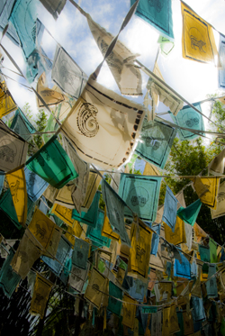
So maybe I took a wrong turn somewhere. Tibetan prayer flags at Disney's Animal Kingdom (2012) Photo (c) Karen Abrahamson


Maps, Magical Thinking and the Magic Kingdom

Maps, Magical Thinking and the Magic Kingdom

So I’m here at Disney World with my sister and nieces. Yesterday we visited the Magic Kingdom and of course had to orienteer our way around the park with the small maps that they provide. Actually the small map was pretty good and we made our way around the park pretty well, taking in the sights the girls wanted to see. Getting to the park was another thing altogether.

Leaving our resort we thought we had it figured out, except I thought one way and my sister thought another. Given she has been here a whopping four hours longer than me, we went by her directions and soon weren’t sure just where we were going. Glory of glories, she said let’s stop and ask for directions, which we did.

It put me in mind of a wee episode I had in Portugal with my beau of that time. There we were in eastern Portugal with a specific destination in mind (I can’t recall what). We followed the route our map showed and ended up travelling a huge loop that did not take us where we wanted to go and we ended right back at our starting point. At which time I suggested we stop for directions. My beau would not.

So we drove that same loop again. And again. With my beau getting madder – not so much because we were lost, but because I kept suggesting we ask for directions. Such repetitious action—travelling the same route again and again, but expecting different results is a lot like something problem gambling Counselors call magical thinking. People with gambling issues play a game of chance again and again believing that the odds of them winning increase with the number of times they play and don’t win BECAUSE THEY HAVE TO WIN SOMETIME. What they don’t realize is that they are wrong. They have exactly the same odds of winning a gambling game each time they play and the house has stacked the odds against them. Just like taking the same hopeless route again and again doesn’t improve our odds of not getting lost.

So stopping for directions was an auspicious beginning to this trip. Aside from the comedienne gas station clerk (who informed me that if I wanted Disneyland (not Disney World) I’d taken a wrong turn for the east coast somewhere) I got straightforward directions that took us direct to the Magic Kingdom. Here are some photos to prove we were there.

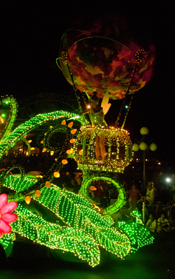
Tinkerbell at the Parade of Lights (2012) Photo (c) Karen Abrahamson
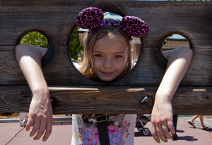
In the Frontierland Stocks (2012) Photo (c) Karen Abrahamson
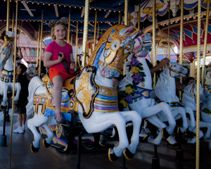
Jo on the Fantasyland Carousel (2012) Photo (c) Karen L. Abrahamson
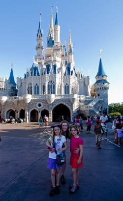
The girls at the Magic Castle (2012) Photo (c) Karen Abrahamson
Books and Geology: Mapping Beneath the Surface

Books and Geology: Mapping Beneath the Surface

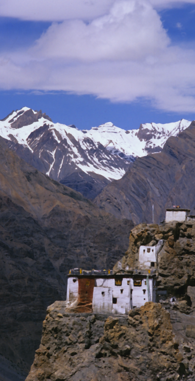
Cliff-side Monastery, Spiti Valley, India (2000)
Cliff-side Monastery, Spiti Valley, India (2000)(photo (c) Karen Abrahamson)

Recently I was reflecting on the difference between plot and story, with plot being the events that happen to keep the story moving, and ‘story’ being what the book is about and the changes that occur to the characters along the way. Frodo starts out as a happy young hobbit, and returns as someone who understands the price that must be paid for the safety of places like the Shire. Bella starts out as this infatuated, clumsy girl who constantly has to be rescued, and turns out to hold the secret abilities to save everyone.

This got me thinking about mapping beneath the surface. In a book, if you are a plotter, you map out where the actions occur, but also the impact the scene has on the character. I started out writing this way, and used wonderful planning sheets like these. This has allowed me to layer stories with the emotional changes that make a story much richer to read.

A similar process has occurred in mapping the world. Once the surface mapping was well under way, people began to wonder how to map the landscape under the layer of dirt and forests we see. Why? To gain a better sense of the layering of the landscape and the connections between places. For example, the discovery of similar strata layers in both France and England demonstrated that once they were a single land mass.

The process of mapping the underside of the earth began around 1750 when a Frenchman named Jean Etienne Guettard asked just such a question about England and France. Though he posed the question, the first person taken seriously for geological mapping was an Englishman named William Smith who spent a quarter of a century mapping England and Wales beneath the ground. Smith had been a surveyor’s helper and a keen observer who noticed and recorded things like strata exposed in hillsides and in mine shafts. Smith was the first person to have the insight that different strata held different fossils from different time periods, which provided a means to date the strata. He also noted that similar fossils were found in similar strata, even though they were separated by long distances. In 1815, the result of his study was a many-colored map of England and Wales that set out the different geological formations.

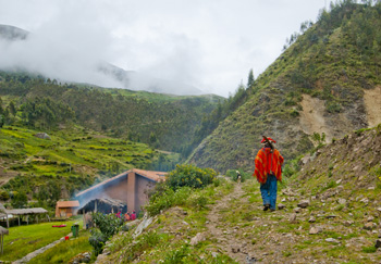
Off to the fields, Pumamarka (2011) Photo (c) Karen Abrahamson

Such a map can set out the distribution of various geological units such as glacial debris (if it was near the surface) or deeper formations like igneous, metamorphic or sedimentary rock that underlie the topsoil. Of course, having a general picture of the structure of the earth wasn’t enough for a civilization with an increasing thirst for oil and minerals, so processes were developed that measured gravitational attraction from which geologists could deduce the nature of the subsurface geology. Other processes drew on the ancient Nordic use of magnets to locate ore bodies. A more modern magnetometer was developed in the 1930s and mounted on aircraft to gather readings. The Seismic method was developed after 1875 when an English geologist in earthquake-prone Japan, thought to use a seisomograph to determine where the quakes arose from. A similar process was used in 1909 to discover the boundary between the Earth’s crust and its mantle.

Using sonic sounds or thumpers or vibrators to create sound, the sonic process then uses geophones (or hydrophones for underwater exploration) to read echoes from underground formations that tell the scientists what lies underneath.

This has led to the ability to measure the crust of the earth (which measures from about 6.5 kilometers thick under the ocean to 50-75 kilometers thick under high mountains), the mantle which extends from the crust to about half way to the centre, and the dense, partly molten core. Seismology has led to the ability to map oil deposits and layers of water and natural gas that wait in the earth’s crust. But they have also allowed scientists to reach much deeper.

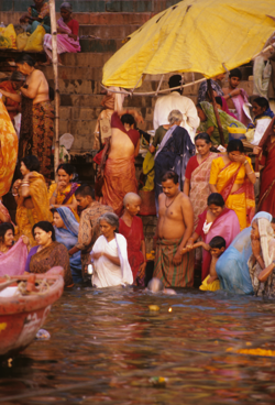
Main Ghat, Varanasi
Main Ghat, Varanasi (2000) Photo (c) Karen Abrahamson

Geologists are now able to measure and map the underside of the earth’s crust (I alluded to this here). Which is a lot like understanding the underside of a novel, because, like the geothermal power of the earth that may save us from global warming,  it’s really the hot emotional underbelly of a novel that brings out the best of any novelist’s writing.


Maps, Highways, and Their Imprint on The World

Maps, Highways, and Their Imprint on The World

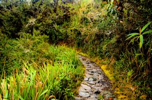
Path through the rain forest on the Camino Inca, Peru (2011) Photo (c) Karen Abrahamson

The ancient T.O. maps didn’t represent reality, but they did map the reality of the Christian spirit at the time. Portolan Charts gave a realistic representation of coastlines and the work of the Indian spy/cartographers, placed rivers on the maps well before aerial mapping existed.

One of the last bastions of ‘unmapped’ territory was the Amazon basin of Brazil. In 1799 Alexander von Humboldt, the son of a Prussian baron, spent five years travelling from Venezuela’s Orinoco river through the Amazon, collecting specimens and surveying. Afterwards he produced 33 volumes of maps and illustrations. That was the last mapping for over a hundred and fifty years except for the occasional scientific or rubber company exploration.

Until 1970.

That’s when the Brazilian government got the idea to construct a highway from the Atlantic Coast, across 5,000 kilometers (about 3,400 miles) of rainforest to the Peruvian border. The construction was a nightmare due to a dearth of maps. The rainforest had too many clouds and—gee, rain in a rainforest?—for aerial mapping to work. The result was construction following ground-based surveyors who were barely ahead of the bulldozers and this led to the construction having to cross the same river multiple times leading to enormous unforeseen costs.

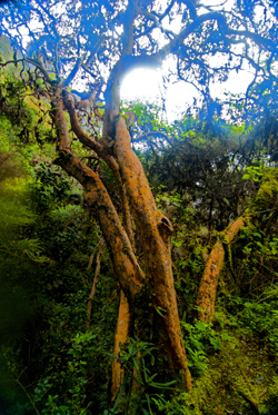
Cloud Forest tree along Camino Inca, Peru (2011) Photo (c) Karen Abrahamson

Enter the cartographers. In this case it was cartographers and the invention of side-looking radar (SLAR). SLAR is an improvement on the radar that helped safe Great Britain during the Battle of Britain. It’s the invention that allows radar to be shot out the side of an aircraft to take long horizontal pictures of the landscape. This technology can ‘see’ through clouds and trees to the landforms. With the help of computers, SLAR can provide accurate pictures of the rise and fall of the landscape.

The survey team with their aircraft arrived in Brazil on the summer of 1971. In just under a year SLAR mapped the Amazon in 32-kilometer-wide swaths which lead to the first detailed maps of the Amazon and an understanding that this huge territory wasn’t the previously-thought Amazon “basin”. Instead they found that only about 20% of the area was lowlands, with most of the landscape being hilly and mountainous.

This ‘sped up’ the construction of the highway which was completed in 2011 except for a single bridge in the Peruvian part of the road. But what has this meant for the area? For some, it replaces weeks of travel on dirt roads to a relatively short drive. For others it promises income from a potential huge influx of tourists. But what it also means is environmental degradation.

Brazil has a long history of environmental issues springing directly from road-building into this relatively delicate biosphere. Previous road building shows that almost 90% of deforestation lies within 50 kilometers of a road (about 23miles). Timber and mineral extraction are followed by hydroelectric dam development and the destruction this causes.

What’s disturbing is that the Amazon is truly the lungs of the world and cartography has provided the data needed to seriously damage those lungs. It places a different perspective on maps; one that undermines the beauty of what I’ve always thought and suggests the need for ethical standards that stand up to the push of corporate greed.

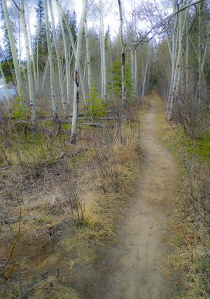
Path along the Yukon River. The quiet places like this are the ones lost in rampant development. (2010) Photo (c) Karen Abrahamson

There are means to ameliorate the potential destructiveness of developments like the Transoceanic Highway or the construction of pipelines like the proposed Northern Gateway pipeline through British Columbia, but it requires people like cartographers, citizens, and government officials to demand agreements that protect the environment BEFORE, planning starts. Otherwise ‘progress’ can just as easily lead to widespread destruction like what is happening in the Amazon.

The new maps of the Amazon not only map progress, but also the destruction of a reality. Unlike the T.O. maps of the Christians that cemented the Christian spirit firmly in Jerusalem, these maps not only mark destruction of biodiversity, but they record the destruction of the spirit of the indigenous people.


Faith, Maps and Portolan Charts

Faith, Maps and Portolan Charts

Okay, I’m anachronism. It’s Easter Sunday and so I’m writing about faith—well, a little bit of faith—faith and maps.

As I’ve said, I like maps and will continue to use them. Though many people are turning more and more to GPS systems in their vehicles, I still have my trusty book of street maps of the metropolitan area where I live. When I pull out my yellowing, dog-eared map book I’m reminded of the volumes of Portolan charts of old, that were the predecessors of the Mercator projection I spoke of HERE.

Portolan charts were mariner charts, used by sailors to navigate the Mediterranean and then the coasts of Africa and Asia. The earliest existing portolan chart dates from 1290, but records as early as 1270 talk of a captain pulling out charts to convince a frightened king that their ship really could reach land during a terrible storm. Portolan charts have distinctive features, most noticeably the rhumb lines and compass roses that gave sailors bearings to set their sailing headings. These rhumb lines set out the four cardinal directions and the principle wind directions (North, Northeast, East, Southeast, South, Southwest, West and Northwest) as well as the eight half-winds (NNE, ENE, etc.) Portolan maps also had detailed, careful place names along the coast, color coding of places to show importance, and standard ways of showing rocks and shoals, while overemphasizing bays and headlands—all important information for sailors trying to reach safe harbor. This is very different from the predecessor of the Portolan, the medieval mappamundi , which generally had East at the top, and Jerusalem at the centre without any detail. The mappamundi were there to represent a way of thinking for the faithful; all they really needed to know was the location of Jerusalem in relation to where they lived. By contrast, the portolan set out in detail the way to make your way in the world.

Yes, there were issues with the portolan charts. They used a rough scale, but had none of the accuracy the Mercator Projection provided. Still, they served their purpose.

No one knows who made the first portolan chart, but researchers have shown that those we know about were copied, some by tracing (they can tell by small pinpricks left in the vellum, and some by simple eyeballing). Portolan charts were also generally written on vellum—sheep or calf skin prepared in such a way that the narrow end of the beast (toward the neck) could fit the narrowing of the Mediterranean. The vellum could handle the rigors of sailing better than paper could and vellum could role up for easy storage or could be made into volumes of portolan charts. Of course, because they had different makers, different parts of the world were drawn using different scales which made it a challenge to draw up larger maps of the world.

But portolan fell out of use with the advent of the Mercator Projection because, while the portolan charts were good for the Mediterranean and coastal shorelines, they were not as good for great sea voyages where the Mercator Projection provided relatively easy ways to chart a route from places like South Africa to New York.

So the beautiful, utilitarian portolan chart fell out of use, just like my map book has fallen out of favor in comparison to those tiny black box GPS units and smart phones that help gadget users to get from point A to point B. To me, it feels like civilization has taken a great leap forward by stepping back. No longer are we worried about great sea voyages (Mercator maps), or even the details of where such and such a place sits along the coast in relation to where we are (Portolan charts). Now we simply input our destination and trust the GPS to tell us which headings to take, much like medieval civilization trusted their priests to tell them how to live in relation to Jerusalem. Which makes me wonder whether we might have stepped right back to the days of the mappamundi, where our sense of direction is directly related to our faith—but today it’s our faith in technology.

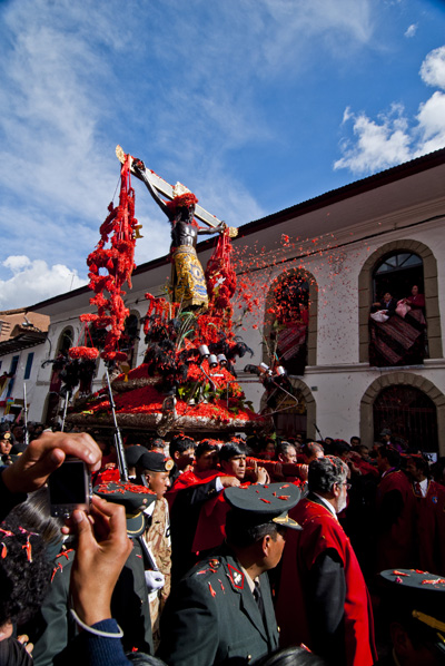
The Easter Procession in Cuzco, Peru. Flower petals are thrown whihc have, over time, stained the Christ figure black. (2010) Photo (c) Karen Abrahamson


The Satisfaction of Maps

The Satisfaction of Maps

A wonderful fromage tree at Angkor ruins (2008) Photo (c) Karen Abrahamson

As I said way back when I started blogging about maps, some of my favorite early memories are of looking at maps with my family as we started out on some adventure, or as I fantasized about places around the world that I wanted to see. I guess that experience made me a map fan. In reaction to my blog about whether maps should be in books, a few blog readers reminded me that they also like to read maps and in particular find satisfaction in maps contained in books because those maps offer the opportunity to better understand the relationship and distances between places written about in the book. The readers enjoyed following along with the characters as they moved across the landscape.

This enjoyment with following voyages isn’t limited to readers. I recently lost an afternoon playing with the Facebook Cities I’ve Visited app. I think Facebook and Tripadvisor are on to something there – the need to record and understand just where we’ve been in relation to where we are right now.

I mentioned previously that I always carry a map when I travel and mark my journey down for my future enjoyment. As a writer, taken in conjunction with my journals, these maps always help me remember the places I’ve been or travelled through and provide a cartographic representation of terrain that my aging brain cells might have forgotten. But maps aren’t just used by me during my journeys. My family always hauls out the atlas and follows along as I wander. On my last trip, to Peru, a network of writer friends around North America followed along as I did sent in my blogs like an itinerant reporter. I suppose the satisfaction for them, was not only that they could follow along, but that they could also get a sense of the relationship of where I was to their location.

Shell seller on the west coast of Zanzibar (1994) Photo (c) Karen Abrahamson

Because although maps represent a greater world, they are also are very egocentric creations. By this I mean that maps are drawn by the creator not necessarily to draw reality, but to draw their reality. Case in point is a lovely 1886 Imperial Federation Map if the World Showing the Extent of the British Empire which shows Britain at the centre of the map (much as the medieval T/O maps showed Jerusalem at the centre of the known world). The wonderful map uses the Meracator projection which nicely enlarges landmasses in the northern hemisphere (including Britain) and also includes mythic Atlas holding aloft the world which is straddled by lithesome Britannia who is surrounded and adored by the lesser ‘races’ (read colonies), all peering up at Britannia’s greatness. Not simply a map it seems, but also a satisfying cartographic representation of the way Brits at that time wanted to view the world and themselves.

To some degree I think the Cities I’ve Visited acts something like the 1886 map: although we aren’t placing ourselves above the world, it gives us comfort with our place in the world. We create our representation of the places we’ve touched and maybe that gives them more reality for us. Perhaps that satisfaction also includes a little reassurance of our place in the world?

So when I was done with Cities I’ve Visited, I was very satisfied that I’d trod so many places in the world, but also fairly embarrassed. I felt almost like I was competing with some cyber-other to show that my vision of the world was broader because I’d been more places. Was it really a competition? The App said the average person has visited 17 cities. I was at 247 and I stopped when I started to feel really stupid (not to mention that I’d wasted a good chunk of the afternoon).

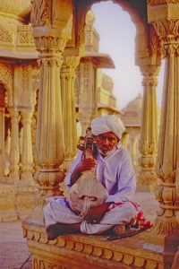
Muscian at tombs above Jaisalmer, India (2000) Photo (c) Karen Abrahamson

The whole experience reminded me of too many tourists I’ve laughed over who arrive at a place, leap out of the tour bus, take a photo and then leave to drive like mad to the next place and the next photo. That phenomena always put me in mind of a mission to collect places like notches on a belt – or like a dog leaving photographic spoor like doggie–do reminders of where they’ve been.

It makes me wonder if our egocentric need for maps is something like our need to collect, buy and own – as a means to quell our unquenchable need for satisfaction.


Rhumb Lines, Novel Writing and How to get from point A to Point B

Rhumb Lines, Novel Writing and How to get from point A to Point B

Dhow in coastal waters off Zanzibar Island (1994) Photo (c) Karen Abrahamson

As I mentioned in a previous post, I’m in the midst of a year of writing sequels. Actually it may take two or three years to get through all the sequels needed for my current novels. As I have already mentioned on this blog I’ve found writing my first sequel a bit of a challenge even though I knew where I was going. It seemed that I kept straying off course.

This puts me in mind of the challenges mariners had back before Gerard Mercator created his famous projection in 1569. A projection is a way of taking three dimensional landforms off of a globe and placing them onto a flat surface (a map) while retaining relative conformity of shape and relation between the landforms. What Mercator did was take meridians of latitude and longitude and make them all aim straight north-south or east-west creating 90 degree angles at each intersection. Sure it expanded the landforms closer to the poles, but it also gave mariners a means of plotting courses over long distances.

Picture this overlaid on top of a typical world map with latitude and longitude laid out.

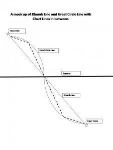
You see, prior to Mercator, mariners shared two fears – bad weather and getting lost. (Actually I share their fears, the latter most particularly when I’m writing.) In the years before Mercator’s projection, mariners had generally confined their sailing to the Mediterranean and coastal waters. The transatlantic voyages to America were done by the stars, but there were no helpful portolano (mariners maps using compass roses to show sailing routes) of the great oceans. Mercator’s grid made sailing the open ocean as easy as sailing the coasts because it gave sailors a means to chart a straight line (a rhumb line) from Point A to Point B across the ocean. From this they could plan their headings and make their voyages.

Of course sailing the distance from Cape Town to New York is about as huge an endeavor as writing a novel (or a sequel) from page one to the end and neither route actually takes a straight line. Sailors travelling that distance recognized that they didn’t travel a flat earth, they travelled a globe and so they added to their calculations, the curve of a great circle that was the largest circle they could draw through a sphere and this route showed the actual shortest distance between two points. Sailors then chose their routes by drawing straight chart lines between the great circle and rhumb line that allowed them to approximate the great circle along the route.

Tall ship off Portuguese coast (2006) Photo (c) Karen Abrahamson

This seems a lot like the process I use when I’m writing. I know where I start and I know where I want to finish (most of the time). The writing process then becomes one of deciding how far to travel from the rhumb line (the plot or the backbone) of the story, for it seems to me that novels have great circles, too. These are the themes you are writing about and you don’t want to allow your plots to take over, so that your story is nothing but plot, but neither do you want your subplots to take you so far out of your way that the story no longer fits within its themes. And that’s where sailing and writing diverge in their process. Sailors use the great circles and rhumb lines to plot their course and they follow it from Point A to Point B. A writer, on the other hand, will use them to plan their novel or their series of novels, but also to look behind and check whether they have wandered too far off course to get to their final destination. This is the challenge in sequels: viewing the second or third book as just one of the charted lines between the rhumb and the great circle, building its way to the ultimate end of the voyage.


Recent Fantasy

Available HERE,

$1.99

Available HERE,
$3.99

Available HERE $1.99


Recent Mystery


Available HERE
$4.99


Available HERE,

$4.99


Available HERE,

$4.99


Available HERE,
$4.99


Recent Romance

Available HERE, $2.99