Category: Maps and Cartography

When Maps Were Born

When Maps Were Born

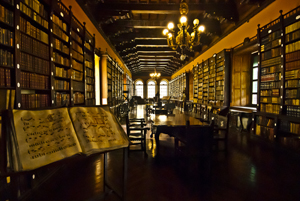
Monastery library, Lima, Peru. (2011) Photo (c) Karen Abrahamson

Writing this series of posts about maps and map makers has brought home that people have been making maps or pictures of places for a very long time, but it has also brought home that what people were making and the reasons they were making them has changed dramatically over the centuries. This change in purpose has led academics to wonder whether maps really were as ubiquitous across human history and they suggest that maps as we know them today really only came into existence in the 15th or 16th century.

What do they base this upon?

First of all it’s the paucity of maps that have remained in existence from earlier times. Sure, time would have destroyed many maps, but surely more than the few we have would have survived, just as art and sculpture and manuscripts survived. Secondly, those ‘maps’ that have survived from earliest times, had purposes that were different than maps today. Some represented a way of seeing the world , for example, the T-O maps I wrote about here, were intended to show Jerusalem as the holy centre of the world. Another example are Mesoamerican maps that didn’t focus on spatial mapping, but instead presented ‘community maps’ that represented history and territory, something like a pictorial genealogy. Native American maps present something similar. Other early maps were diagrams of a monasteries and manors, and still others served as religious icons, mandalas, construction drawings, itineraries and so on. Different maps, different purposes, and definitely not the purpose we put maps to, today.
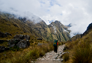
Porter on the Camino Inca, Peru (2011) Photo (c) Karen Abrahamson

The proponents of the idea that maps as we know them began in the latter half of the second millennium, also point to how the current purpose of maps – namely representing space or relationships, or showing ownership, or pointing out how to get from point A to point B were purposes that had previously been accomplished using means other than maps for as long as there has been history. If people wanted to represent a place, there were paintings and art work. For relationships, there was genealogy. If they wanted to convey ownership, there was text to use, or numbers. And if they wanted to show how to get from point A to point B, well there was word of mouth or text. These had sufficed for centuries. Why did people need these things called maps?

The answer apparently came with the rise of the nation state in the 15th and 16th Century (and possibly as early as the 12th Century in China). As nations expanded, as military ventures demanded, the need for maps became more evident. Rulers such as Henry IV of France were advised that maps could convey an idea of his holdings better than words could. Other rulers such as the Hapsburg emperor Charles V lost vital battles for wont of a map of a strategic area. And this wasn’t just a European experience. In places like Japan there is little evidence of widespread use of national maps until 1591 when suddenly maps were commanded for all geopolitical areas, leading to a national map in the 1630s. And Japan isn’t alone: at the same time that Japanese and European mapmaking blossomed, similar mapmaking flourished in China, Thailand, Russia, Malaysia, Vietnam and the North American Colonies.

Yes, some of this flourishing may have been due to importation of mapmaking from one culture to another as international trade broadened, but academics suggest that the ease of the adoption of these skills speaks to the existence of similar map-making traditions that had sprung up independently across cultures at the same time. Why?
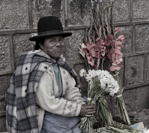
Flower seller, Cusco, Peru (2011) Photo (c) Karen Abrahamson

Map making appears to have proliferated in the new nation-states where it would otherwise be difficult for a central government to ‘know’ the length and breadth of their nation, suggesting maps brought local knowledge from the hinterlands into the center of government, where that knowledge could be used to the service of the central state. So modern maps themselves, just like the lines we draw on them, were an act of control – not just setting boundaries on the landscape, but also establishing boundaries around the people who dwelt there.



In Search of a World Map

In Search of a World Map

This week I finished the second draft of book two in my post apocalyptic fantasy, Terra Incognita, series. It wasn’t easy because it required a fairly major rewrite of much of my major character’s attitudes and motivations because I hadn’t mapped my character out from book one to book three. As I get started on Book Three, I’m thinking about how the importance of a consistent road map across a series of books is just as important as a consistent map of the world.

My last post spoke of the work done to standardize measures in mapmaking that led to the creation of the scientific metric measuring system. But the creation of the metric system was only the start in a venture to create of a consistent set of maps of the world. This might not seem sexy, but think about traveling to a different locale and finding the maps you are using don’t use consistent measurements and contradict each other. You end doing a mass of translations to make the maps work or you might end up throwing the maps out because they are so inconsistent it’s easier to simply start from scratch. That was the situation for many explorers because the maps they had might have used a consistent measurement scale (but not always), but were also based on measurements started from different starting points. In other words the Prime Meridian had never been agreed upon.

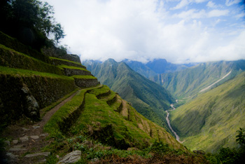
The trail turns upwards (2011) Photo (c) Karen Abrahamson

After the agreement about the metric system, there were still disagreements in the cartographic world. One of the major ones was the position on the earth from which meridians (the imaginary lines drawn on the earth from pole to pole that connect all spots along the longitude) should be referenced – in other words where was the zero point on the globe from which all other distances would be measured. To this point in time, where measurements began depended upon the nationality of the scientist conducting the measurement.

The need for a Prime Meridian had existed for all Cartographers. Ptolemy had chosen the Fortunate Islands – at his time the westernmost extent of the world. But the age of politics had national sentiment taking precedent with the French recommending the zero point’s location in Paris, the Spanish recommending either Toledo or Cadiz, the Italian Pisa or Rome, and Americans wanting Washington or Philadelphia etc. It took the International Meridian Conference in 1884 to settle on Greenwich as the Prime Meridian which gave us our zero longitude, and also set our clocks and time zones with Greenwich Mean Time.

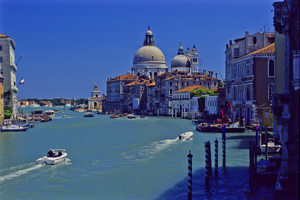
Venice's Grand Canal (2004) Photo (c) Karen Abrahamson

A later conference of the International Geographic Congress realized the mapping issues I mentioned above meant that there was a need to revise the world’s maps to create a consistent map of the world. It led to a proposal for an International Map of the World that would all be drawn to a single scale – 1:1,000,000 (1 centimeter =10 kilometers or 1 inch equals 15.78 miles) – leading to the name of the project being the Millionth Map. It would also be drawn using standardized symbols and colors. The project was debated for a period, but after examples of the maps were produced, in 1913 an agreement was reached. Maps were to be created for each 4 degrees of latitude and 6 degrees of longitude, not paying attention to national boundaries. All place names had to use the Roman alphabet.

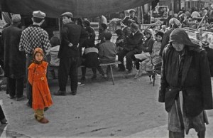
Little Uigher girl, Sunday Market, Kashgar, Western China (1997) Photo (c) Karen Abrahamson

It was a slow process. Between 1913 and the start of the First World War only eight maps were produced out of a total of 2,500 required to map the world. Between 1921 and 1946, the American Geological Survey produced the 107 maps that comprised the map of Hispanic American (North and South America). By the 1930s 405 maps had been produced in total, but the central repository of the maps (in Paris) was largely destroyed during the Second World War. In 1953, the United Nations assumed responsibility for oversight of the project, but by the 1980s only 800-1000 maps had been completed and many were not completed using exactly the same standards. Since then the U.N. has stopped even reporting on the project, so after all this work the Millionth Map languishes and who knows when you’ll fall right off its edges when you visit another country and have to work with maps that don’t mesh.

This suggests that I had better get busy and piece together the latitudes and longitudes of book three in my series, so that all of the books provide a complete and consistent picture of Terra’s world.


Maps, Measures and Krypton Atoms: The weight of cartography

Maps, Measures and Krypton Atoms: The weight of cartography

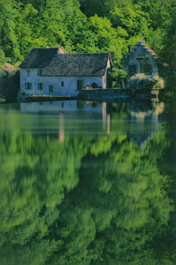
Old water mill in the countryside near Besoncon, France (2004) Photo (c) Karen Abrahamson

Last week I talked about the north and the impact of northern European perspective on the rest of the world. But other impacts of cartographers on human culture have perhaps gone less noticed. Case in point is the development of the metric measuring system and in particular the meter.

I grew up in Canada when the country was making the transition from Imperial (inch, foot, yard) measures, to the metric system. All I knew was the meter was a problem I had to solve and it’s interesting because I still think in both systems, flipping between the two much like a person who speaks multiple languages. At the time of the conversion there was much bemoaning the triumph of this foreign system no one in the public understood or knew anything about, but the meter grew out of science and at its heart, it arose from cartography.

The metric system was developed in France at the end of the 18th century in response to a burgeoning plethora of measuring systems that differed across each province in that country. Consider the toise, for example, which measured about 6 French feet (which were longer than Imperial feet – go figure). The trouble was, most measures grew out of some local whim, much like the yard (originally the length of a sash used by Saxon Kings, and then the distance from the tip of King Henry the First’s nose to the end of his thumb). The toise supposedly was half the width of the Louvre’s main gate.

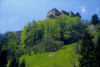
Castle near Pontarlier, Eastern France (2004) Photo (c) Karen Abrahamson

But these unscientific (and in France, inconsistent) measures made it impossible for scientists from different jurisdictions to talk to each other, and difficult for maps created in different jurisdictions to be amalgamated into a larger map of France. As a result, in 1790 the French Academy of Science, at the request of the French government, embarked on a search to create an invariable standard of measurement and weight. They chose to create a measurement that would be one ten millionth of the meridian distance between the North Pole and the equator and measures of weight were to be developed from the unit of length. The name to be given to the new measure was metre or meter, derived from the Greek work metron, meaning ‘a measure’.

The trouble was, after the decision, they had to determine how long the meter was. They had tentative data about the meridian distance from the North Pole to equator due to earlier surveys, but they needed more accurate data and decided to run a survey between Dunkerque and Barcelona – a portion of a single meridian. The political and social instability in France at this time made the feat more difficult than it sounds. The surveyors, strangers, were often mistaken and arrested as spies because of their strange instruments and white surveyor flags that happened to be a royalist color (remember the French revolution). Eventually they completed their survey and the academy prepared a platinum bar the length of a standard meter to establish this length. This changed the estimated length of the meter by less than 0.3 millimeters, indicating how accurate previous surveyors had been.

Crepe maker, Paris (2004) Photo (c) Karen Abrahamson

From this, the weight of a cubic centimeter of water became a gram, a cubic decimeter became the liter Canadians and much of the world use for fuel and milk today. For France’s issue with inconsistent measures was also an issue across the globe. In 1875, twenty nations met in Paris to adopt the Convention of the Meter and it is the measure of science around the world. But the meter still had one final change to make. In 1960, to increase the meter’s consistent length (remember how the curve of the world and the thickness of its crust impact measurements) the definition of its length changed to the length of a certain number of wavelengths of light emitted by krypton atoms. Thankfully, this didn’t mean any real change in its length.


In Maps the Truth is an Illusion

In Maps the Truth is an Illusion

Once upon a time there was a mapmaker who lived in the Northern hemisphere, and who from amongst the four cardinal directions, chose north as the primary direction at the top of the map. Not that it didn’t make sense. Men had taken their direction from the North Star for eons, but this was different than the religious maps that had existed until then, which often, at least for Christians, placed the east as the cardinal direction(as that was the direction of paradise). But this ancient mapmaker with his northern bent started a trend that has continued to this day. Our maps are oriented northward, and consequently they give primacy to the north.

For those of us who live in the north this doesn’t seem like an issue, but anthropologists and historians suggest that this emphasis on the north has colored how we think of the world. They posit that maps embody the interests of their creators and that emphasis on the north contributed to phenomena like African colonization, South American conquest, the Anglo-Indian Raj, and Orientalism, where northerners believed they had the god-given right to claim the land and ‘civilize’ the natives. Heck it wasn’t that long ago in human mapmaking history that we thought the south was populated by single footed beings who used their overlarge foot as shade against the killing southern sun. Anthropologists and historians propose that the northern cultures believed that they were the civilized nations. Therefore the south wasn’t, or so the story goes.

There are those who say that the map structure itself with its focus on the north as at the top and the south at the bottom, created or embodied a thinking error that, in turn, created the sociopolitical situation in the world today with the north as the ‘have‘ nations and the south as ‘have nots.’

All this illustrates that maps hold power beyond the simple placement of landscape features. We use maps for illustrating far more than roads and mountains and political boundaries. Maps are used to present information about populations and this information has incredible power. Poverty. Number of people per square mile. Alcohol consumption. The owner to dog ratio. All of these things have been presented in maps and once they are presented this way, the knowledge of the poverty or population density or alcohol use or dog to person ratio becomes the reality of a particular location. The trouble is that often these informational maps focus the viewer on only one thing to the exclusion of all else.

Case in point is a series of maps of a community I’m working with. These maps show the vulnerabilities of a community’s population by neighbourhood. Policy makers and managers who view these maps want to focus all their resources on the neighbourhoods with the highest percentage vulnerability. Sound like the right thing to do?

Perhaps. But what if I told you that the neighbourhood with the highest vulnerability also has one of the smallest populations? What if I told you that the vulnerable population of another neighbourhood, while being a smaller percentage, actually far outnumbers the vulnerable population of the first neighbourhood in terms of actual people? What do you think then?

And if I told you that the first neighbourhood contains virtually all the community resources of the combined neighbourhoods, would you expect the policy makers and managers to rethink their resource allocation decision?

Waiting for the Tulku (reincarnated lama) Spiti, India (2000) Photo (c) Karen Abrahamson

The trouble is this often doesn’t happen. Well-meaning people take the face value of a map and think it’s the truth, instead of looking at the layers of truth behind the map. Often these layers hold just as many faults as the map we are looking at, but failing to look leaves all the layers unquestioned. When this happens, these well-meaning people may propagate a thinking error that, though well-intended, has the potential to lead map readers astray, just like that ancient map-maker’s work.


Mapping Loss: Maps and the Enbridge Pipeline

Mapping Loss: Maps and the Enbridge Pipeline

Last week I wrote about how the cartographers of the early western mapping tradition created North America in the public’s imagination through their tales of the Garden of the World that awaited the person daring enough to travel westward, and through their splendid maps that unrolled the future in the shapes of the landscape.

But maps also set out losses. Ancient maps show the destructive ebb and flow of empires across the landscape as mankind shifted capitals and allegiances or had them imposed by various leaders. We see Tyre and Babylon and Troy washed away by time, but maps of their greatness remain, some etched in stone, some recreated by scholars to hint at the greatness we have lost through time. The same can be said for the great maps drawn by Lewis and Clark and others, for as they rolled the country out for settlers, they marked horrible future losses of North America’s First Peoples. Indeed, you could say that the unfolding of the maps of North America rewrote reality from that of native people, to that of the settlers.

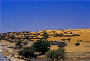
Devouring dunes, Mauritania, West Africa (1994) Photo (c) Karen Abrahamson

In more modern times we’ve seen maps used to show the devastating paths of tsunamis and the epicenters of quakes. Maps show us the destructive forces of nature, like the creeping dread of the Sahara desert, or the paths of hurricanes and tornados and the arcs of loss across the states where those killers touch down. Maps also portrayed manmade disaster like the destruction let loose by the Deepwater Horizon, as its killing oils reached the silver reed coastlines of the Gulf of Mexico. Maps of hydroelectric projects mark the loss of valley’s forests, and Indian villages with the blue lines of deep water.

Equally, or perhaps more, important maps show us future losses. Right now, in Canada, maps abound showing the proposed path of the Enbridge Oil Sands pipeline from the Alberta oil sands all the way across northern British Columbian mountain ranges and muskeg to a narrow fjord at a town called Kitimat on the Pacific Ocean. From there, supertankers will collect crude oil for the industries and cars of China.

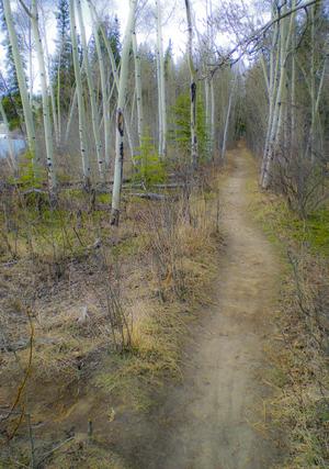
Yukon Path, (2009) Photo (c) Karen Abrahamson

Proponents of the pipeline speak of it as if it marks prosperity across this country, like a vein of money that will bring jobs in the construction phase and open the purse of China right into Canadian government coffers. But an overlay on that map also speaks of potential loss. Supertankers threaten to rewrite our coastlines from the pristine home of orca and sea otter, to the barrens left behind by oil spills. Broken pipelines threaten salmon spawning grounds and the haunts of those icons, the moose and beaver, not to mention the homes of the great, great grandchildren of those same First People we stole the continent from years ago.

The trouble is, most people just look at what is, and they don’t see the competing futures these maps propose anymore than people driving past a proposal sign for local development question the losses that development will cause. Those who propose the development see prosperity in new homes for sale and new retail stores. Whereas, reading the losses, I see the destruction of the trees and the birds and small animals that live within their green space.

So I’m suggesting we need to take the time to reread our maps and recognize the losses our development proposes. Otherwise we threaten to be like our forefathers and repeat their destructions. We need to listen to North America’s First People and remember the animals we share this earth with. Otherwise we threaten the very Garden of the World that caught settlers imaginations so many years ago. If we don’t, we’re likely to end up like the civilizations on those ancient maps – lost in time and remembered only for all the destruction we caused.

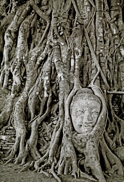
Buddha in ruins, Ayuthaya, Thailand (1997) Photo (c) Karen Abrahamson


Westward Ho!

Westward Ho!

I’m sitting here watching the snow fall on the western edge of North America and contemplating how with the spread of people over all of the continents leaves no mysterious ‘promised land’ to cling to. As I’ve written in previous posts, in earlier centuries people sought Prestor John or mysterious islands. They sought an easy route to India and the Northwest Passage. All of these were, over time, debunked, but in our restless human need to seek, we replaced those distant vistas with something else. At least in the past we did.

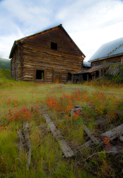
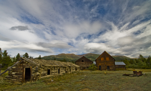
Old Ranch, Yukon (2009) Photo (c) Karen Abrahamson

The exploration of North America helped with that. As the surveyors moved west they opened up awareness of a great mysterious place called the American West. The acquisition of the Louisiana Purchase brought Lewis and Clark’s expedition and knowledge that the western mountains were more than one range and a new awareness of how broad the continent was. While they set to rest the final hopes that the Columbia and Missouri Rivers might connect and form a Passage to India, tales of what they had seen brought a new hope that, if not a promised land, there might at least be a Garden of the World in the rich lands westward.

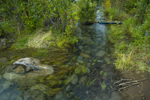
Channel at edge of Yukon River (2009) Photo (c) Karen Abrahamson

Lewis and Clark were followed by the Topographical Engineers – a small elite branch of the army, whose most famous member was John Charles Fremont. Fremont took with him a red-faced German topographer named Charles Preuss. With Kit Carson, these three set out to map the trail west, determine where to establish outposts, and scout passes over the mountains. While the results of their first venture were of only limited value for its maps, Fremont’s dramatic escapades of planting a US flag on a high peak to demonstrate the national resolve of ‘America strong and triumphant from sea to sea’, and his colorful journal, apparently launched many settlers westward. Subsequent Fremont/Preuss ventures resulted in some of the best maps of the day, extending knowledge down into California and erasing as much fanciful cartographic information, as it established. Preuss’s expertise in creating maps led not only to cartographic information, but also to the first ‘road map’ to the west.

Other explorers like John Wesley Powell, extended our knowledge of areas around the Grand Canyon as they travelled down the Green River and into the cataracts of the Colorado River within the Canyon. His further expeditions surveyed much of southern Utah from the Colorado to the Nevada line. Powell’s work also resulted in warnings about the old methods of agricultural farming. The warnings weren’t heeded and it took the dust bowl dirty thirties to prove him right. But Powell gave America an even greater legacy. He lobbied for, and finally achieved, the creation of the United States Geological Survey, which continues to this day to provide detailed maps of the country.

Old Ranch, Yukon River (2009) Photo (c) Karen Abrahamson

The only problem with this is that detailed maps removed the mystery and it seems to me it impacted the human psyche. From America, explorers joined the Europeans in the further exploration of our planet. We delve into the depths of the ocean, the frigid wastes of the Arctic, and into the humid breadth of the Amazon Rain Forest. But even those areas are being explored and the race for space seems to have died. It makes me wonder if part of the anger and anxiety we see in our culture isn’t partially due to the fact we have no new vista to call us and no new ‘promised land’ to bring out our best.


Boundaries and Goals: The straight edge of the map

Boundaries and Goals: The straight edge of the map

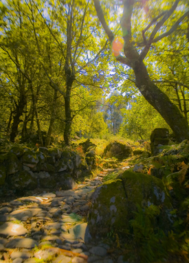
Old Roman Road, Portugal (2005) Photo (c) Karen Abrahamson

I just read a great post by my friend and fellow writer, Matthew Buchman. Matt wrote about goal setting and why he always sets hugely high goals, and how he (usually) berates himself for not reaching those goals instead of celebrating the numerous accomplishments his goals have helped him achieve. He also wrote about how he intends to continue set superhuman goals, because it keeps him going, pursuing the dreams he has for his writing. This got me thinking about goals and maps, because what is a goal, anyway, but a map of where you are trying to go? You set your goals farther and you’ll probably go farther. You set easy to accomplish goals and you might not reach the brass ring you really wanted to achieve.

This made me think about the boundaries we place around our lives and how the mapmakers of North America have perhaps influenced how we think. I’m talking about the surveyors who first set boundaries across the landscape. At first, North American surveyors took a metes and bounds approach to surveying, much the same as is used in England. A metes and bounds description might be something like, Beginning at the cherry tree growing where Hazy Creek joins the Swift River, north along Swift River 200 rods to the stone wall next to Cascade bridge bordering the road, then West along the road to a lightning-struck maple at the corner of Christopher Hopper’s place, thence, south toward Hazy Creek where a cairn has been set next to the ford, and thence eastward along Hazy Creek to the beginning place.

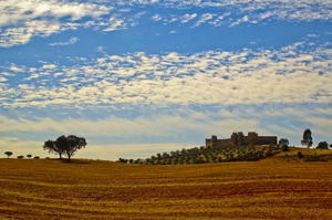
HIlltop Fortress, Alentejo, Portugal (2005) Photo Karen Abrahamson

This approach to placing boundaries relative to the landscape, shifted with the survey of the Mason-Dixon line, to an approach dependent upon accurate readings of latitude, and on a process of taking horizontal measure with a chain and surveyors level and frequent (every 10 degrees or 17.5 kilometers) astronomical observations. They even made careful adjustments for the earth’s curvature.
Surveyors subsequent to Mason and Dixon used similar methods as they moved forward to comply with the Land Ordinance Act of 1785, which modified a proposal originally made by Thomas Jefferson, to use the principle of rectangular surveys, instead of the irregular metes and bounds, to partition the landscape. Congress envisioned a series of townships along the Ohio River and up to the great lakes and so on westward. As a result, teams of surveyors headed west with axemen chopping a line through the forest. Of course the Indians had other thoughts about the measuring of the land which they thought of theirs. But the surveyors kept coming and the trees fell as the surveys were made and the lands of America became something new: a checkerboard landscape of straight lines and right angles as exemplified by the four corner meeting if Utah, Colorado, New Mexico and Arizona and as seen on any map of America.
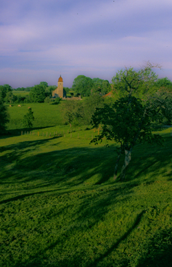
French village spire (2004) Photo Karen Abrahamson

How does this relate to goals? Well all these straight lines got me wondering if setting too-clear boundaries might also set boundaries in our minds. It got me wondering if Matt’s ideas of setting goals that almost surely surpass our abilities (read boundaries) might actually make us reach farther.

With that in mind, I’ve modified my annual writing goals as follows:


Original:

  • Write 30 pages a week
  • Write four novels (or three if one is a fat fantasy)
  • Post one blog a week
  • Publish at least one new short story and three novels
  • Work on craft of openings and voice

Revised writing goals:

  • Write 30 pages a week
  • Write four novels (or three if one is a fat fantasy)
  • Post one blog a week
  • Publish 25 items (Novels and short stories) in 2012
  • Work on craft of openings and voice.
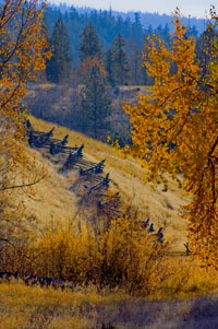
Snake fence along the Kane Lake Road, British Columbia, (2006) Photo(c) Karen Abrahamson

The thought of publishing 25 items fills me with fear because it means I have to write those stories or novels. I knew I could accomplish the 3-4 novels, but I don’t know if I can accomplish this. So I’ve stretched beyond those neat little borders I set for myself. I’m back into the wild spaces marked by metes and bounds. And you know what? If you fly over all those neatly surveyed spaces, you’ll find that fence lines and roads and buildings generally follow more natural paths anyway. So here’s to breaking boundaries and going to those new places nature takes us.


Mapping Dark Matter – Walking Like an Inca

Mapping Dark Matter – Walking Like an Inca

A recent Facebook posting referred me to an article about dark matter and how astronomers are mapping dark matter through space by identifying how light distorts as it travels through the invisible web of the dark. Scientists hope that, by mapping dark matter’s distribution through the sky, they can gain a better understanding of this substance and the underlying physics of the universe.

Reading this article reminded me of my recent trip to Peru and the unique Incan astronomy. Most of us are taught that the Incan’s worshiped the sun, and indeed the sun was a deity to the nobles. But beyond that worship, the Inca used their astronomical studies to not only follow the sun, moon and stars, but also to map the dark parts of the sky. They even had a special word for those places: ‘Yana Phuyu’, or dark clouds – the vacant places in the sky.

Huinay Huayna, Forever Young, hung above the Urubumba River (2011) Photo (c) Karen Abrahamson
Huinay Huayna, Forever Young, hung above the Urubamba River (2011) Photo (c) Karen Abrahamson

The Inca believed the Milky Way was a great river and the Yana Phuyu were animals called Pachatira that came from mother earth to drink at its side. These dark clouds were known and tracked across the sky and watched with interest. There was the fox, the black llama with her child, the serpent, the toad, the partridge. Each had their place in the sky and each was watched for signs of what would happen on earth. As the black llama descended from the sky she would lower her head and drink from the oceans to stop flooding. The toad, Hanaptu, rose in the sky, when the toads came out of hibernation, and Azoq, the fox rose during the summer solstice when foxes gave birth. For that was the strength of Inca astronomy, they truly believed ‘as above so below’. They watched the heavens and foretold the seasons and the rains by when certain animals appeared over the horizon or climbed the sky and, according to legends, major ecological events like devastating earthquakes and floods, along with the ages of the world.

But the Inca did more than that. They saw the heavens as a map of their world, with the great river of the Andes, the Rio Vilconota (aka the Urubamba) as the terrestrial version of the Milky Way. They recognized hundreds of holy sites (Huacas) around their empire that often were related to special days of the year and the places where the rising and falling sun was observed.

Today, stories of the skies are still taught to children in Inca villages. In Quechua they teach how the llamas in the fields watch the heavenly llama for news of the rains. They tell tales of the moon and his wife and how the ‘fall’ of the Moon’s wife led to the pumpkin-color of the soil in the Amazon. So though we will never know the true depths of Inca astronomical knowledge – too much was lost to the Spanish conquest – we do know that the Inca were much like the scientists of today: They mapped the heavens as a means to understand the connections of the universe around them.

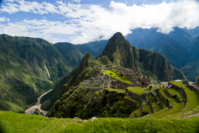
Machu Picchu caught in the coil of the coil of the Urubamba River (2011) Photo (c) Karen Abrahamson


Maps and Spies

Maps and Spies

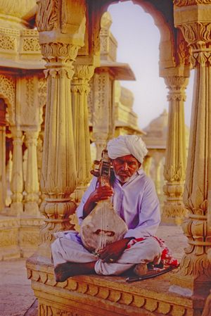
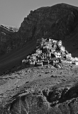
Himalaya Monastery outpost (2000) Photo (c) Karen Abrahamson

In one of my last posts (here) I wrote about how Sir Francis Drake may have been the real first discoverer of the Pacific Northwest coast, and how this fact was likely kept under wraps by the British government because of the potential for Spanish spies. Maps and spies have gone hand-in-hand for years and are still important in modern battles. I recently picked up the book Swan Song and the opening scene is the President looking at spy satellite images (maps) of Russian Territory. Spies and maps. That’s what this post is about.

Of course spy satellites weren’t always around, but spies were, and they have played an important role in the Great Game of Asia (the name given to the period between 1813 and 1907 when the Brits and Russians duked it out over influence and ownership over Central Asia). Being able to map an area and to gain control over important vantage points, rivers, towns and countries was all part of ‘the game’. The Survey of India I mentioned here, was all part of the British Raj’s need to know about and control their holdings.

But they ran up against a barrier – the physical boundary of the Himalayan Mountains and the geopolitical border with Tibet that had been closed by order of the Chinese Emperor. Although Europeans had sighted the heights of K2 and had scaled peaks only slightly less tall than Mount Everest, they hadn’t been able to map Tibet because of the Chinese border that specifically excluded Europeans. As a result, a captain of the Indian Survey, Thomas G. Montgomerie, decided to train and send disguised native agents into the mountains. Only two men passed the rigorous training: cousins Nain and Mani Singh.

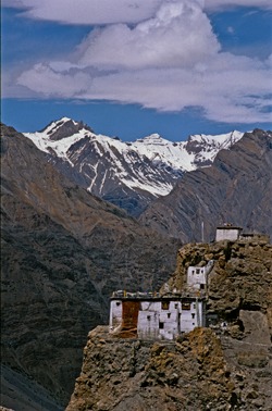
Himalayan Monastery along the Spiti Valley India (2000) Photo (c) Karen Abrahamson

In 1865 they went on their first mission through Nepal and into Tibet to try to reach Lhasa. The two became separated on their journey. Mani made it into western Tibet and returned with some mapping information, but it was Nain who managed to make it to Lhasa. Along the way he was robbed, but managed to retain his survey instruments. Trained to take even paces as his means of measuring distance and using a 100-bead rosary to keep track of his pace-count, he eventually entered the fabled city disguised as devout pilgrim. There he chanced public beheading by taking night-time measurements of altitude and latitude using mercury he poured into his begging bowl.

When he thought people were becoming suspicious of him, he left the city with a Ladakh caravan and headed west along the great Tibetan river, the Tsangpo. Along the way he mapped the river’s course and kept up his careful measures before finally escaping one night to make his way back across the Nepali border. He’d travelled 2,000 miles and mapped it all and returned with descriptions of Lhasa and the first reasonable placement of it on the map.

Nain’s accomplishment was followed by similar mapping parties, not all of which ended well. One agent travelled into northern Afghanistan and was murdered in his sleep. Another returned to Lhasa and back to India with data on almost 48,000 square kilometers of previously unmapped territory. A nephew of Nain’s continued the work and travelled for nearly six years in the mountains. He’d mapped a caravan route to China as well as the headwaters of the Mekon, the Salween and Irrawaddy rivers.

More impressive still, is the adventure of Kinthup, another native trained to survey the mountains. In 1880, he and another man were sent into the mountains to answer the question of whether the Tsangpo River became the Brahamputra. He braved the mountains and escaped after being sold as a slave by his ‘partner’ on the venture, but still managed to complete his mission in a feat that became legendary to Survey of India.

But it was only in 1911, after the Great Game was over, that the mapping of the Himalayas was completed, when the British joined their surveys with those of the Russians they had so long fought against. But it was brave native spies like Nain Singh and Kinthup who did the work for us and brought Lhasa and the Himalayas into the known world.

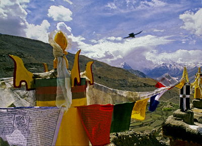
Himalayas and Crow (2000) Photo (c) Karen Abrahamson
A Christmas Map of Place and Time

A Christmas Map of Place and Time

I put up the Christmas tree the other day, uncovering each tissue-wrapped ornament before putting it on the tree. My mother commented on how each one was so unique and that made me reflect on how each ornament was a memory that solidified and evoked a place that I had visited, or a certain place and time in my life.

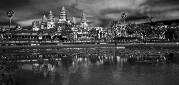
Angkor across the pool

On the tree were ornaments purchased in Peru, and others from Tanzania, Cambodia, St.Thomas, and India. The tiny painted gourd Peruvian cuy (guinea pig), hung side by side with the wee silk elephant I found in Thailand. A German bauble my mother-in-law gave me hung next to a globe found at a French clock-maker’s shop at a town next to the Swiss border and a Pueblo Indian Virgin Mary sent by my parents from Arizona. All of these brought back memories of Christmas eve feasts, times in the Angkor heat or the chill of the Himalayas, and standing on the Serengeti plains.

Two of the dearest decorations were a handmade snowman and a tiny wooden cuckoo clock. The cuckoo reminds me of times with my stepsons and ex-husband out riding the wilds of Central British Columbia. You see, that area is ranching country complete with wolves and bears and miles of undeveloped forest. In the winter it was covered with snow-laden pine and spruce. At Christmas, there was no better way to start the season than to saddle up our horses and head out into that pristine winter land.

We’d take an axe and an old horse blanket with us and head out into the forest, the horses blowing steam through their nostrils as they bounded through hock-deep snow, my sons rosy-cheeked as they raced their horses ahead until they came whooping back to announce that had found the PERFECT tree. That was what the ride was all about. We’d follow them – usually out to some clearing where a smaller tree would stand. My husband would dismount and shake the snow off, getting it all over himself and then, as a family, we’d critique the tree they’d found. If it passed muster, we’d chop the tree down, wrap it in the blanket and tether the blanketed tree to the horn of one saddle before starting our (much slower) ride home dragging the tree behind us. That would bring the official tree into our home and the small cuckoo clock was one of the first ornaments we bought as a family.

The snowman ornament was made by my youngest stepson. We didn’t have a lot of money in those days – at least not for ornaments for the tree – so he and I set out to make some. I still have the small green felt tree I made, but his is special: a stuffed white snowman complete with scarf, and broom and a black top hat all carefully sewn by ten-year-old hands. I smile and think of him, long grown to a man, whenever I find it each year.

And so my Christmas tree today is a guardian of riches worth more than the presents under it. Those glittering branches hold not only my memories, but also a map of the treasures of my life.

Merry Christmas.

Recent Fantasy

Available HERE,

$1.99

Available HERE,
$3.99

Available HERE $1.99


Recent Mystery


Available HERE
$4.99


Available HERE,

$4.99


Available HERE,

$4.99


Available HERE,
$4.99


Recent Romance

Available HERE, $2.99