Month: February 2012

In Search of a World Map

In Search of a World Map

This week I finished the second draft of book two in my post apocalyptic fantasy, Terra Incognita, series. It wasn’t easy because it required a fairly major rewrite of much of my major character’s attitudes and motivations because I hadn’t mapped my character out from book one to book three. As I get started on Book Three, I’m thinking about how the importance of a consistent road map across a series of books is just as important as a consistent map of the world.

My last post spoke of the work done to standardize measures in mapmaking that led to the creation of the scientific metric measuring system. But the creation of the metric system was only the start in a venture to create of a consistent set of maps of the world. This might not seem sexy, but think about traveling to a different locale and finding the maps you are using don’t use consistent measurements and contradict each other. You end doing a mass of translations to make the maps work or you might end up throwing the maps out because they are so inconsistent it’s easier to simply start from scratch. That was the situation for many explorers because the maps they had might have used a consistent measurement scale (but not always), but were also based on measurements started from different starting points. In other words the Prime Meridian had never been agreed upon.
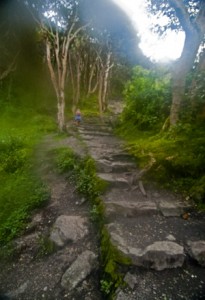
The trail turns upwards (2011) Photo (c) Karen Abrahamson

After the agreement about the metric system, there were still disagreements in the cartographic world. One of the major ones was the position on the earth from which meridians (the imaginary lines drawn on the earth from pole to pole that connect all spots along the longitude) should be referenced – in other words where was the zero point on the globe from which all other distances would be measured. To this point in time, where measurements began depended upon the nationality of the scientist conducting the measurement.

The need for a Prime Meridian had existed for all Cartographers. Ptolemy had chosen the Fortunate Islands – at his time the westernmost extent of the world. But the age of politics had national sentiment taking precedent with the French recommending the zero point’s location in Paris, the Spanish recommending either Toledo or Cadiz, the Italian Pisa or Rome, and Americans wanting Washington or Philadelphia etc. It took the International Meridian Conference in 1884 to settle on Greenwich as the Prime Meridian which gave us our zero longitude, and also set our clocks and time zones with Greenwich Mean Time.
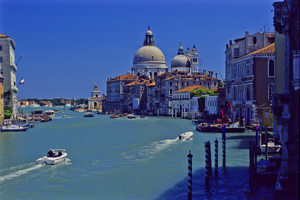
Venice's Grand Canal (2004) Photo (c) Karen Abrahamson

A later conference of the International Geographic Congress realized the mapping issues I mentioned above meant that there was a need to revise the world’s maps to create a consistent map of the world. It led to a proposal for an International Map of the World that would all be drawn to a single scale – 1:1,000,000 (1 centimeter =10 kilometers or 1 inch equals 15.78 miles) – leading to the name of the project being the Millionth Map. It would also be drawn using standardized symbols and colors. The project was debated for a period, but after examples of the maps were produced, in 1913 an agreement was reached. Maps were to be created for each 4 degrees of latitude and 6 degrees of longitude, not paying attention to national boundaries. All place names had to use the Roman alphabet.
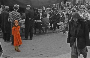
Little Uigher girl, Sunday Market, Kashgar, Western China (1997) Photo (c) Karen Abrahamson

It was a slow process. Between 1913 and the start of the First World War only eight maps were produced out of a total of 2,500 required to map the world. Between 1921 and 1946, the American Geological Survey produced the 107 maps that comprised the map of Hispanic American (North and South America). By the 1930s 405 maps had been produced in total, but the central repository of the maps (in Paris) was largely destroyed during the Second World War. In 1953, the United Nations assumed responsibility for oversight of the project, but by the 1980s only 800-1000 maps had been completed and many were not completed using exactly the same standards. Since then the U.N. has stopped even reporting on the project, so after all this work the Millionth Map languishes and who knows when you’ll fall right off its edges when you visit another country and have to work with maps that don’t mesh.

This suggests that I had better get busy and piece together the latitudes and longitudes of book three in my series, so that all of the books provide a complete and consistent picture of Terra’s world.



Maps, Measures and Krypton Atoms: The weight of cartography

Maps, Measures and Krypton Atoms: The weight of cartography

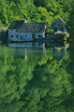
Old water mill in the countryside near Besoncon, France (2004) Photo (c) Karen Abrahamson

Last week I talked about the north and the impact of northern European perspective on the rest of the world. But other impacts of cartographers on human culture have perhaps gone less noticed. Case in point is the development of the metric measuring system and in particular the meter.

I grew up in Canada when the country was making the transition from Imperial (inch, foot, yard) measures, to the metric system. All I knew was the meter was a problem I had to solve and it’s interesting because I still think in both systems, flipping between the two much like a person who speaks multiple languages. At the time of the conversion there was much bemoaning the triumph of this foreign system no one in the public understood or knew anything about, but the meter grew out of science and at its heart, it arose from cartography.

The metric system was developed in France at the end of the 18th century in response to a burgeoning plethora of measuring systems that differed across each province in that country. Consider the toise, for example, which measured about 6 French feet (which were longer than Imperial feet – go figure). The trouble was, most measures grew out of some local whim, much like the yard (originally the length of a sash used by Saxon Kings, and then the distance from the tip of King Henry the First’s nose to the end of his thumb). The toise supposedly was half the width of the Louvre’s main gate.

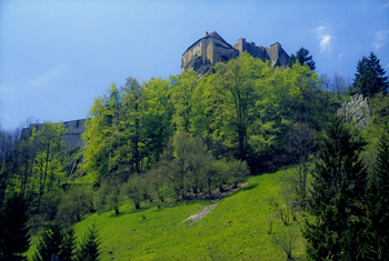
Castle near Pontarlier, Eastern France (2004) Photo (c) Karen Abrahamson

But these unscientific (and in France, inconsistent) measures made it impossible for scientists from different jurisdictions to talk to each other, and difficult for maps created in different jurisdictions to be amalgamated into a larger map of France. As a result, in 1790 the French Academy of Science, at the request of the French government, embarked on a search to create an invariable standard of measurement and weight. They chose to create a measurement that would be one ten millionth of the meridian distance between the North Pole and the equator and measures of weight were to be developed from the unit of length. The name to be given to the new measure was metre or meter, derived from the Greek work metron, meaning ‘a measure’.

The trouble was, after the decision, they had to determine how long the meter was. They had tentative data about the meridian distance from the North Pole to equator due to earlier surveys, but they needed more accurate data and decided to run a survey between Dunkerque and Barcelona – a portion of a single meridian. The political and social instability in France at this time made the feat more difficult than it sounds. The surveyors, strangers, were often mistaken and arrested as spies because of their strange instruments and white surveyor flags that happened to be a royalist color (remember the French revolution). Eventually they completed their survey and the academy prepared a platinum bar the length of a standard meter to establish this length. This changed the estimated length of the meter by less than 0.3 millimeters, indicating how accurate previous surveyors had been.

Crepe maker, Paris (2004) Photo (c) Karen Abrahamson

From this, the weight of a cubic centimeter of water became a gram, a cubic decimeter became the liter Canadians and much of the world use for fuel and milk today. For France’s issue with inconsistent measures was also an issue across the globe. In 1875, twenty nations met in Paris to adopt the Convention of the Meter and it is the measure of science around the world. But the meter still had one final change to make. In 1960, to increase the meter’s consistent length (remember how the curve of the world and the thickness of its crust impact measurements) the definition of its length changed to the length of a certain number of wavelengths of light emitted by krypton atoms. Thankfully, this didn’t mean any real change in its length.


Free Fiction

Free Fiction

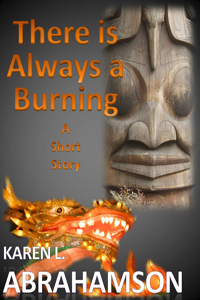
There is Always a Burning –

Karen L. Abrahamson

When an imprisoned djinn offers a eunuch Chinese Admiral his heart’s desire, it threatens the whole history of North America – unless the Admiral can make choices worthy of the man he hasn’t been for a very long time.  To read on click here.

New Short Fiction

New Short Fiction

Ice Dragon

By Karen L. Abrahamson

Only the brave and the lucky can survive the walking dead, the frozen winter and the perilous ice dragon.

When seventeen-year-old Jazella of Gruenheld faces a forced marriage to the ancient Venerable Heed, she makes the decision to leave the safety of Gruenheld’s stockade walls in hopes of obtaining the treasure that will buy her freedom. Faced with the dead and the dragon, will her luck hold?

Available on Smashwords and Amazon


In Maps the Truth is an Illusion

In Maps the Truth is an Illusion

Once upon a time there was a mapmaker who lived in the Northern hemisphere, and who from amongst the four cardinal directions, chose north as the primary direction at the top of the map. Not that it didn’t make sense. Men had taken their direction from the North Star for eons, but this was different than the religious maps that had existed until then, which often, at least for Christians, placed the east as the cardinal direction(as that was the direction of paradise). But this ancient mapmaker with his northern bent started a trend that has continued to this day. Our maps are oriented northward, and consequently they give primacy to the north.

For those of us who live in the north this doesn’t seem like an issue, but anthropologists and historians suggest that this emphasis on the north has colored how we think of the world. They posit that maps embody the interests of their creators and that emphasis on the north contributed to phenomena like African colonization, South American conquest, the Anglo-Indian Raj, and Orientalism, where northerners believed they had the god-given right to claim the land and ‘civilize’ the natives. Heck it wasn’t that long ago in human mapmaking history that we thought the south was populated by single footed beings who used their overlarge foot as shade against the killing southern sun. Anthropologists and historians propose that the northern cultures believed that they were the civilized nations. Therefore the south wasn’t, or so the story goes.

There are those who say that the map structure itself with its focus on the north as at the top and the south at the bottom, created or embodied a thinking error that, in turn, created the sociopolitical situation in the world today with the north as the ‘have‘ nations and the south as ‘have nots.’

All this illustrates that maps hold power beyond the simple placement of landscape features. We use maps for illustrating far more than roads and mountains and political boundaries. Maps are used to present information about populations and this information has incredible power. Poverty. Number of people per square mile. Alcohol consumption. The owner to dog ratio. All of these things have been presented in maps and once they are presented this way, the knowledge of the poverty or population density or alcohol use or dog to person ratio becomes the reality of a particular location. The trouble is that often these informational maps focus the viewer on only one thing to the exclusion of all else.

Case in point is a series of maps of a community I’m working with. These maps show the vulnerabilities of a community’s population by neighbourhood. Policy makers and managers who view these maps want to focus all their resources on the neighbourhoods with the highest percentage vulnerability. Sound like the right thing to do?

Perhaps. But what if I told you that the neighbourhood with the highest vulnerability also has one of the smallest populations? What if I told you that the vulnerable population of another neighbourhood, while being a smaller percentage, actually far outnumbers the vulnerable population of the first neighbourhood in terms of actual people? What do you think then?

And if I told you that the first neighbourhood contains virtually all the community resources of the combined neighbourhoods, would you expect the policy makers and managers to rethink their resource allocation decision?

Waiting for the Tulku (reincarnated lama) Spiti, India (2000) Photo (c) Karen Abrahamson

The trouble is this often doesn’t happen. Well-meaning people take the face value of a map and think it’s the truth, instead of looking at the layers of truth behind the map. Often these layers hold just as many faults as the map we are looking at, but failing to look leaves all the layers unquestioned. When this happens, these well-meaning people may propagate a thinking error that, though well-intended, has the potential to lead map readers astray, just like that ancient map-maker’s work.


Mapping Loss: Maps and the Enbridge Pipeline

Mapping Loss: Maps and the Enbridge Pipeline

Last week I wrote about how the cartographers of the early western mapping tradition created North America in the public’s imagination through their tales of the Garden of the World that awaited the person daring enough to travel westward, and through their splendid maps that unrolled the future in the shapes of the landscape.

But maps also set out losses. Ancient maps show the destructive ebb and flow of empires across the landscape as mankind shifted capitals and allegiances or had them imposed by various leaders. We see Tyre and Babylon and Troy washed away by time, but maps of their greatness remain, some etched in stone, some recreated by scholars to hint at the greatness we have lost through time. The same can be said for the great maps drawn by Lewis and Clark and others, for as they rolled the country out for settlers, they marked horrible future losses of North America’s First Peoples. Indeed, you could say that the unfolding of the maps of North America rewrote reality from that of native people, to that of the settlers.

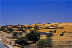
Devouring dunes, Mauritania, West Africa (1994) Photo (c) Karen Abrahamson

In more modern times we’ve seen maps used to show the devastating paths of tsunamis and the epicenters of quakes. Maps show us the destructive forces of nature, like the creeping dread of the Sahara desert, or the paths of hurricanes and tornados and the arcs of loss across the states where those killers touch down. Maps also portrayed manmade disaster like the destruction let loose by the Deepwater Horizon, as its killing oils reached the silver reed coastlines of the Gulf of Mexico. Maps of hydroelectric projects mark the loss of valley’s forests, and Indian villages with the blue lines of deep water.

Equally, or perhaps more, important maps show us future losses. Right now, in Canada, maps abound showing the proposed path of the Enbridge Oil Sands pipeline from the Alberta oil sands all the way across northern British Columbian mountain ranges and muskeg to a narrow fjord at a town called Kitimat on the Pacific Ocean. From there, supertankers will collect crude oil for the industries and cars of China.

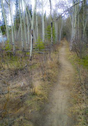
Yukon Path, (2009) Photo (c) Karen Abrahamson

Proponents of the pipeline speak of it as if it marks prosperity across this country, like a vein of money that will bring jobs in the construction phase and open the purse of China right into Canadian government coffers. But an overlay on that map also speaks of potential loss. Supertankers threaten to rewrite our coastlines from the pristine home of orca and sea otter, to the barrens left behind by oil spills. Broken pipelines threaten salmon spawning grounds and the haunts of those icons, the moose and beaver, not to mention the homes of the great, great grandchildren of those same First People we stole the continent from years ago.

The trouble is, most people just look at what is, and they don’t see the competing futures these maps propose anymore than people driving past a proposal sign for local development question the losses that development will cause. Those who propose the development see prosperity in new homes for sale and new retail stores. Whereas, reading the losses, I see the destruction of the trees and the birds and small animals that live within their green space.

So I’m suggesting we need to take the time to reread our maps and recognize the losses our development proposes. Otherwise we threaten to be like our forefathers and repeat their destructions. We need to listen to North America’s First People and remember the animals we share this earth with. Otherwise we threaten the very Garden of the World that caught settlers imaginations so many years ago. If we don’t, we’re likely to end up like the civilizations on those ancient maps – lost in time and remembered only for all the destruction we caused.

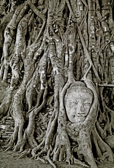
Buddha in ruins, Ayuthaya, Thailand (1997) Photo (c) Karen Abrahamson


Recent Fantasy

Available HERE,

$1.99

Available HERE,
$3.99

Available HERE $1.99


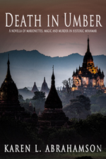
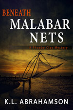
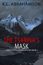
Recent Mystery


Available HERE
$4.99


Available HERE,

$4.99


Available HERE,

$4.99


Available HERE,
$4.99


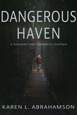
Recent Romance

Available HERE, $2.99